I designed a Mountain Warehouse shopping-app concept to help first-time skiers choose clothing. Building on three years with the brand, I researched the guidance beginners needed, mapped the journey and developed the Figma prototype, with colleague feedback informing the design.
Course-associated app concept · Designed and developed in Figma.
Discovery
Where did first-time skiers need guidance?
Desk research, forum analysis and informal conversations with colleagues and friends highlighted uncertainty about what first-time skiers needed to bring or buy.
My competitive review looked at onboarding, product discovery, kit lists and guided shopping. I explored a wider kit-planning idea, then developed the clothing-bundle journey shown here.
Observed need
Uncertainty about what to bring or buy for a first ski trip.
Design interpretation
Give the shopper an understandable starting set.
Response shown in the prototype
Group clothing into a pack, retaining an individual size choice for each item.
How my discovery inputs shaped the bundle journey.
Flow & development
How should the bundle journey work?
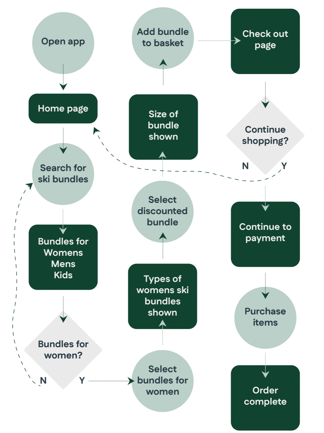
I mapped a route from home to audience categories, pack selection, basket and checkout, with an option to continue shopping. This kept the bundle connected through the journey.
View larger ↗Planned route: find a pack, review it and continue toward checkout.
Work out the choices before the polish.
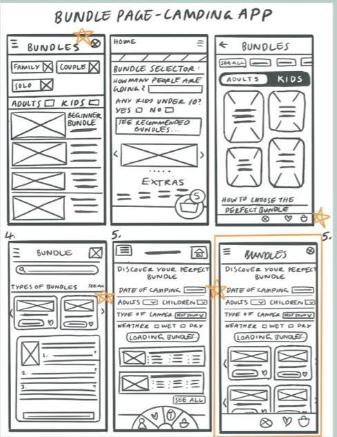
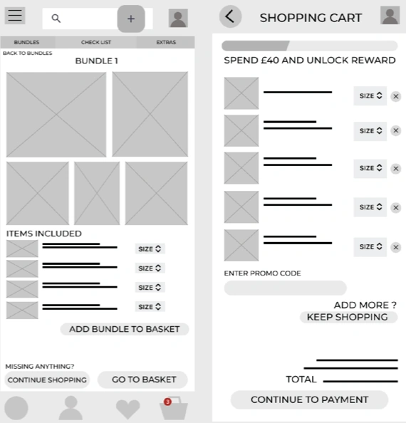
The earlier camping-bundle layouts compare audience and kit selectors. In the low-fidelity detail and basket views, I put size choices beside the included items and gave the pack one add-to-basket action.
View larger ↗Earlier camping-bundle sketches compare ways to find a suitable pack.View larger ↗Low-fidelity detail and basket views place item sizes within the pack purchase.
Entry
How can shoppers browse or sign in?
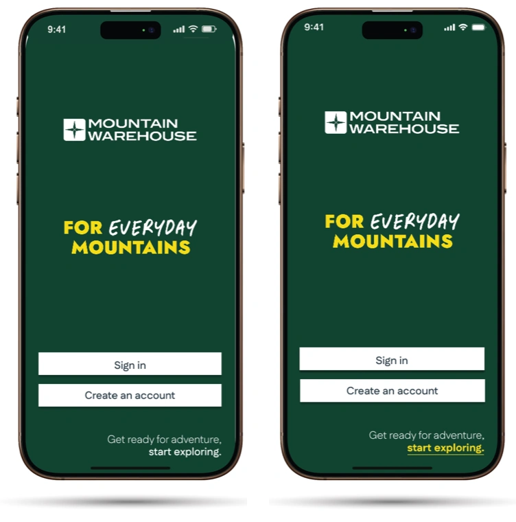
I wanted a quick, simple way into the collection. The earlier welcome screen offers sign-in, account creation and “Start exploring”, while the account route uses a focused email-and-password form.
View larger ↗Earlier welcome: account choices and a Start exploring route into browsing.View larger ↗Earlier sign-in: a focused form with account benefits and password recovery.
Bundle
Choose each size, buy one pack.
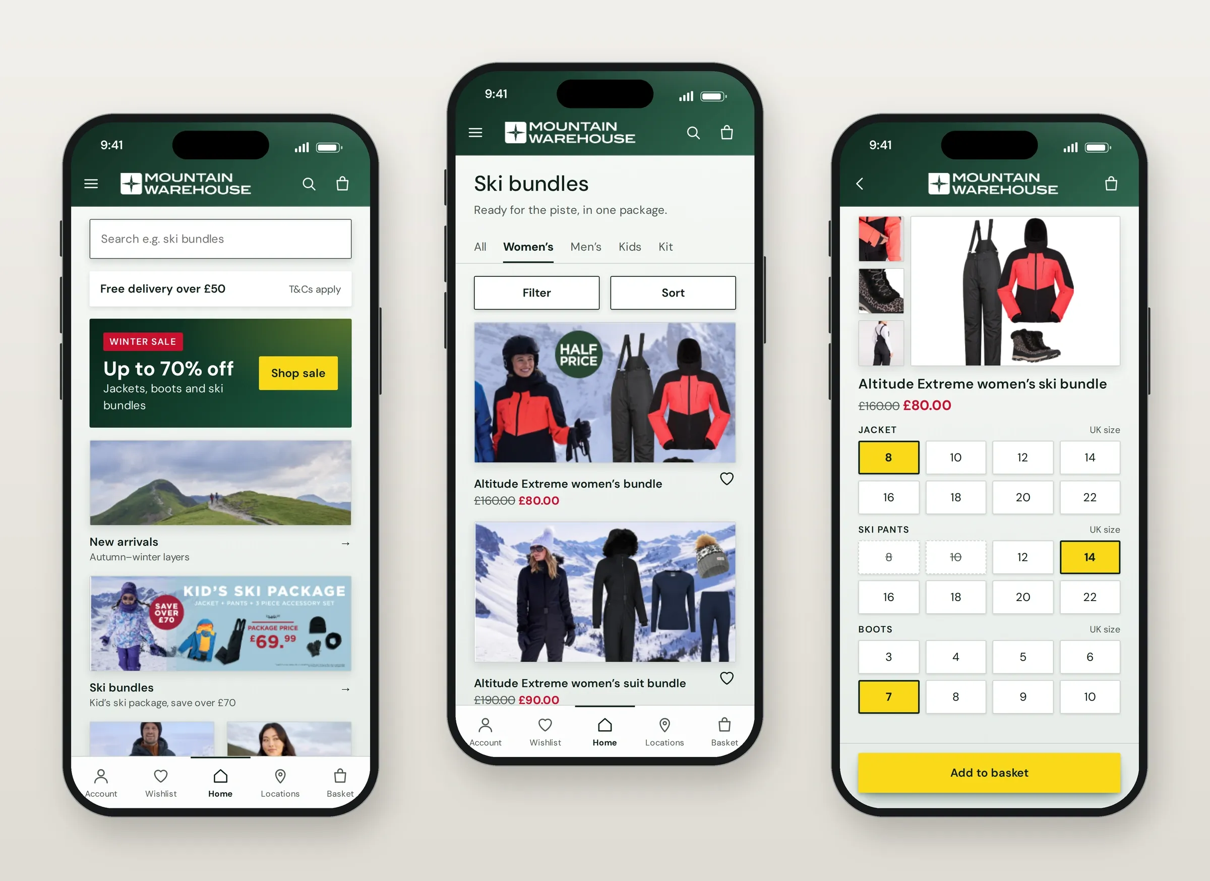
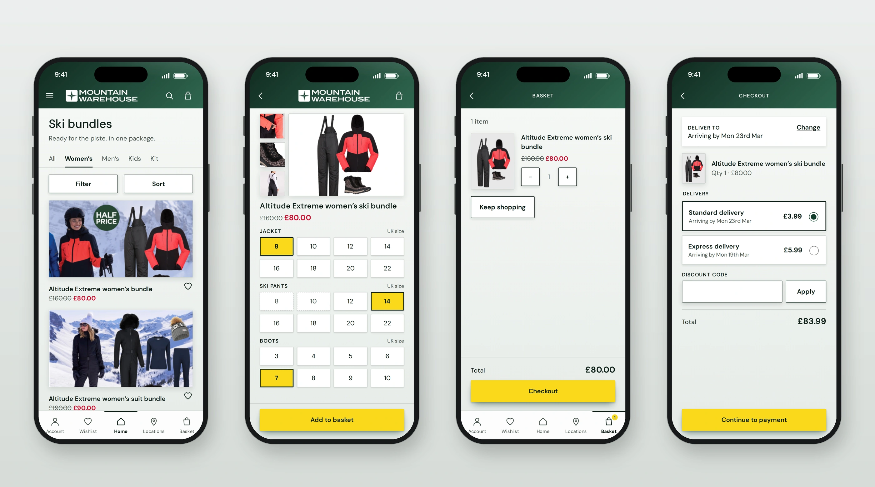
I kept the pack as one purchase while retaining a size choice for each item. The basket presents it as one item, then checkout keeps the pack visible beside delivery options. Yellow actions and gradient headers give the screens a consistent visual treatment.
View larger ↗Bundle listing → individual sizes → basket → delivery, with the pack kept together throughout.
Study & revisions
What changed after the shopping tasks?
A task-based Google Doc.
After the first high-fidelity mock-up, I ran an unmoderated usability study using a structured Google Doc. I asked people to reach the home page, find and add a ski bundle, then return home.
Give the browse invitation more emphasis.
The “Start exploring” invitation was missed. I made the link yellow and underlined to give it more emphasis within the welcome message.
View larger ↗Earlier → revised: colour and underline emphasise the browse invitation.
Represent the wider ski audience.
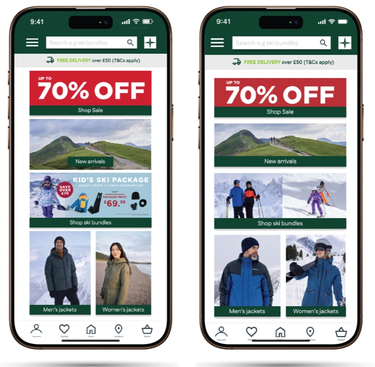
The children’s promotion made it unclear whether the bundles were for everyone. I replaced it with broader skiing imagery, connecting the home promotion with the wider collection.
The prototype brings ski-clothing selection into one route, with a size choice for each item. Task feedback showed that the route into browsing and the audience of the offer needed clearer communication; the revisions address those two points. Next, I would test the revised entry and return navigation with first-time skiers.