Candidate assessment · UI conceptGamification / Onboarding / Interface design
PocketWise
A growing plant. A way to gamify saving.
Overview
I designed PocketWise as a finance-app concept combining savings progress with a growing plant and calendar-led spending preparation. My work covers the concept, onboarding and interface design.
- My contribution
- Concept, onboarding, interface design & visual identity
- Context & output
- Four-day design exercise · Static interface concept
Inputs
What did the app review help me prioritise?
Trust and tone
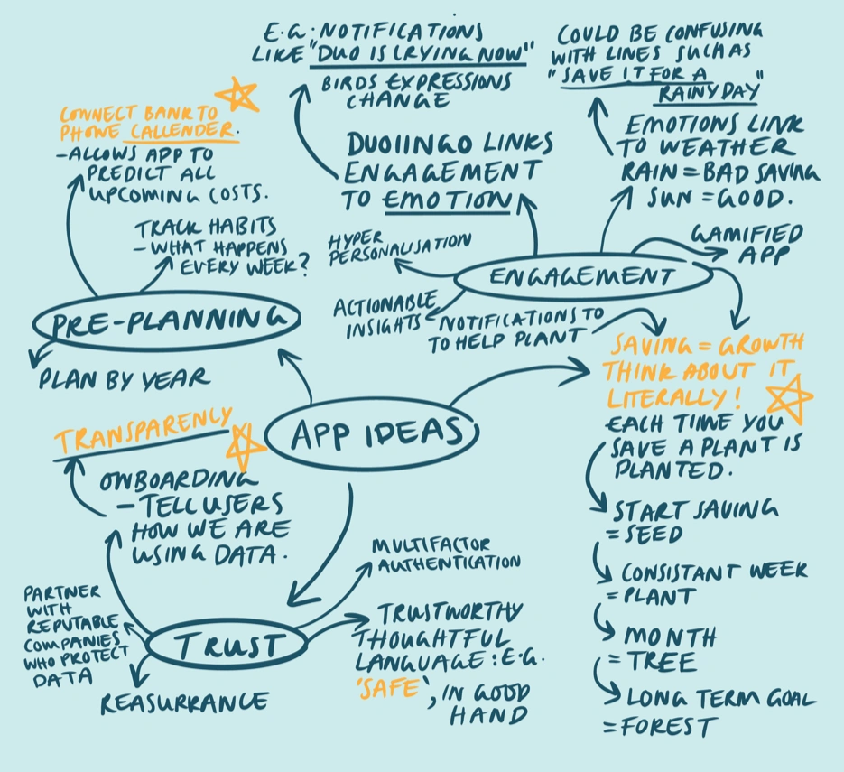
I tried Cleo and Emma and read public reviews. Clear data explanations, onboarding progress and encouraging messages stood out as patterns I wanted to carry into PocketWise.
Planning around personal events
Calendar-led planning around personal events was missing from the apps I reviewed. I made pre-planning a priority alongside spending summaries and reminders.
Concept
Make growth the idea and identity.
Saving as growth
The brief focused on onboarding and proactive financial advice. I developed the plant mechanic to give saving progress a visible form: a seed, plant and longer-term tree or forest.
A plant-and-pocket identity
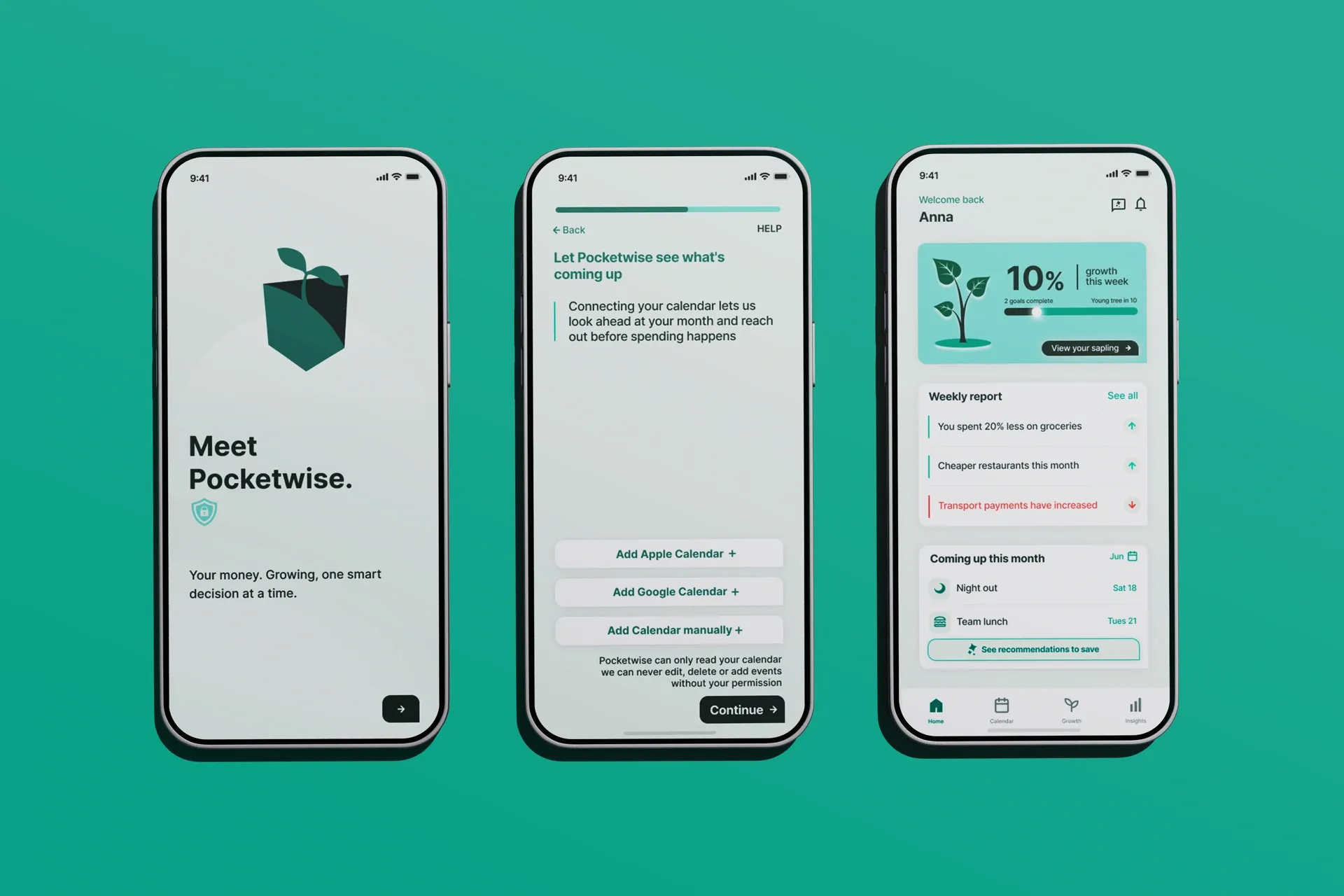
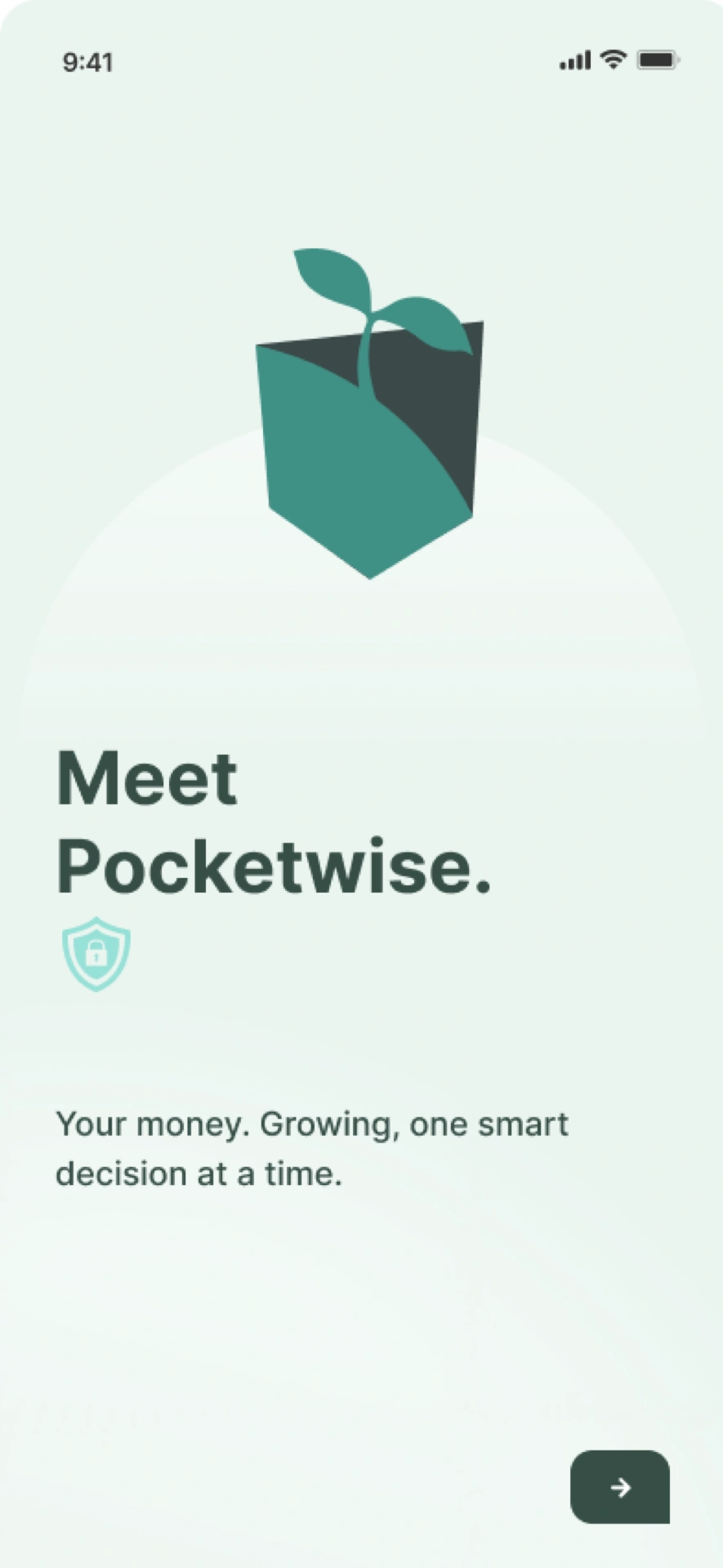
I designed the logo as a plant emerging from a pocket, with a pale teal palette and a lower-right forward action on the welcome screen.
Onboarding
Explain the value before asking for data.
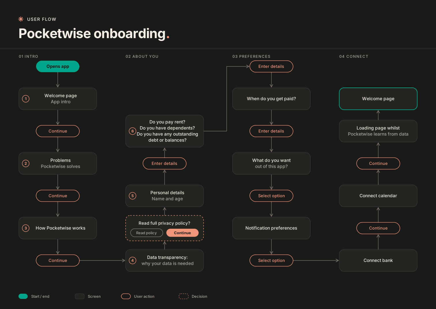
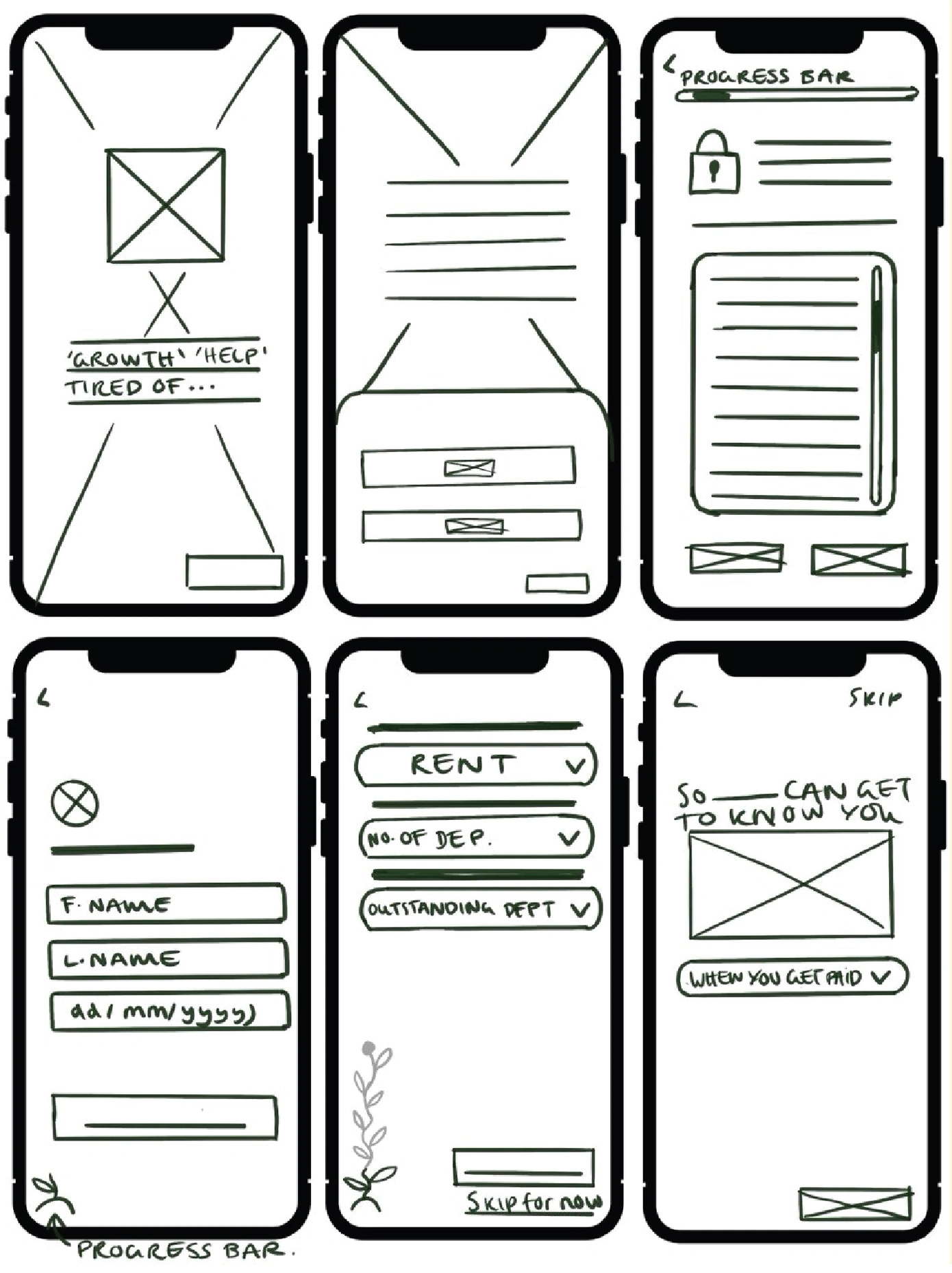
Connection requests ask for trust, so I planned the explanation first. The flow introduces what PocketWise does and why data is needed, then asks about personal context and notification preferences before the proposed bank and calendar connections.
Paper wireframes gave the sequence a layout, with space for progress, context questions and skip options. This kept the ordering decision visible as the screens took shape.
User control
Keep choices visible and the tone supportive.
Context questions
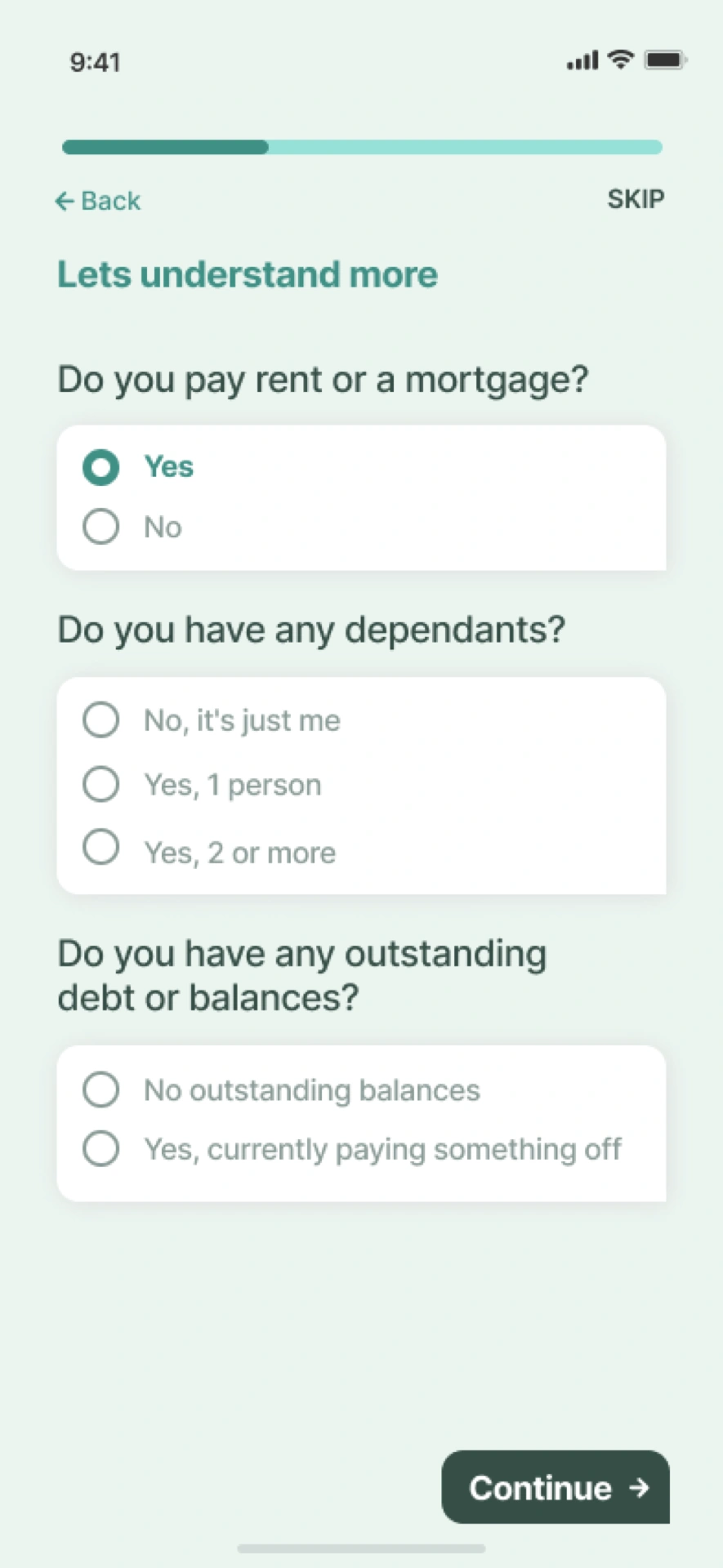
I kept Skip visible alongside the context questions. Labelled choices and radio-button shapes add cues beyond colour, reflecting the accessibility priorities I explored during ideation.
A manual calendar alternative
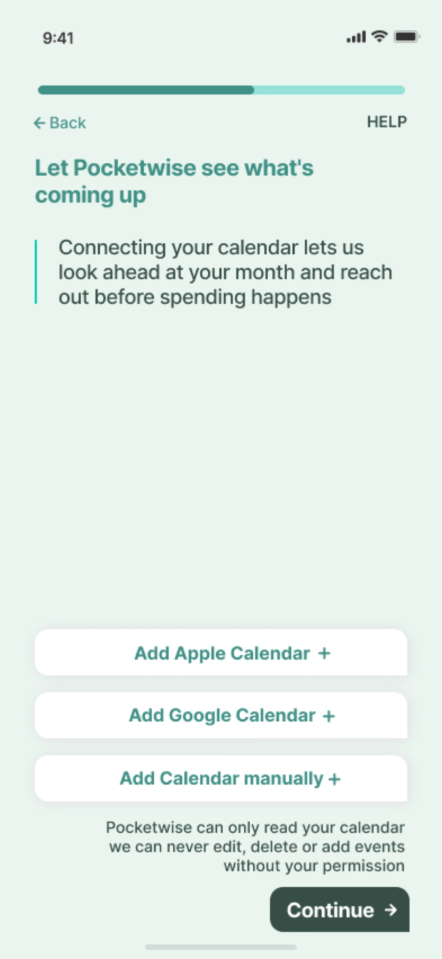
I explained why calendar data would help before offering Apple, Google or manual entry. Help stays available so someone can decide what to share and how.
Advice with a response
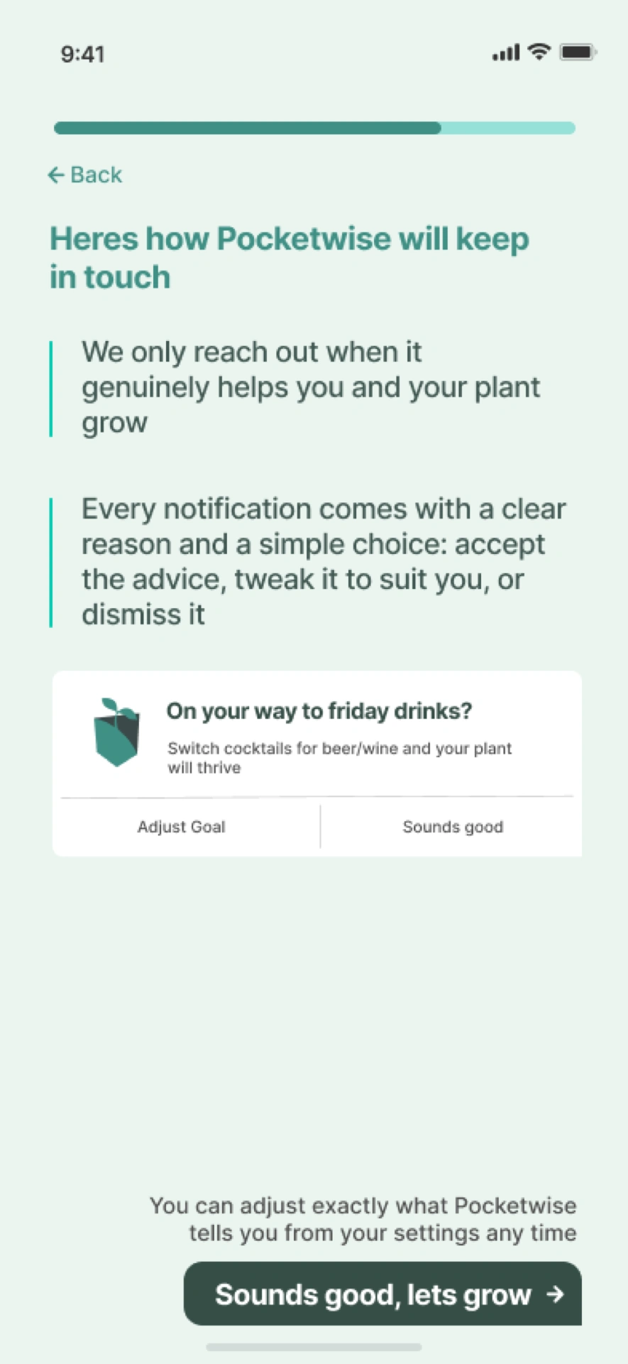
I used a conversational tone for accepting, adjusting or dismissing advice, showing “Adjust Goal” and “Sounds good”. Contrast, plain language and a supportive tone remain accessibility priorities to evaluate.
Pre-planning
Connect upcoming plans with spending choices.
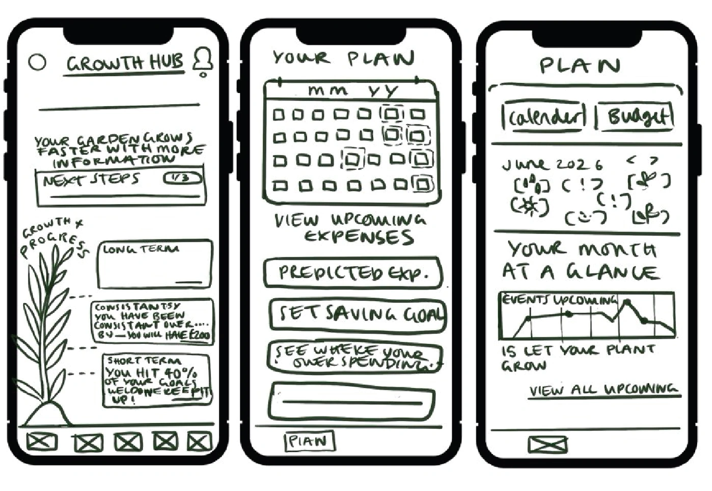
I sketched the growth hub and planning views together, linking progress with upcoming expenses. These layouts gave the plant mechanic a place beyond onboarding.
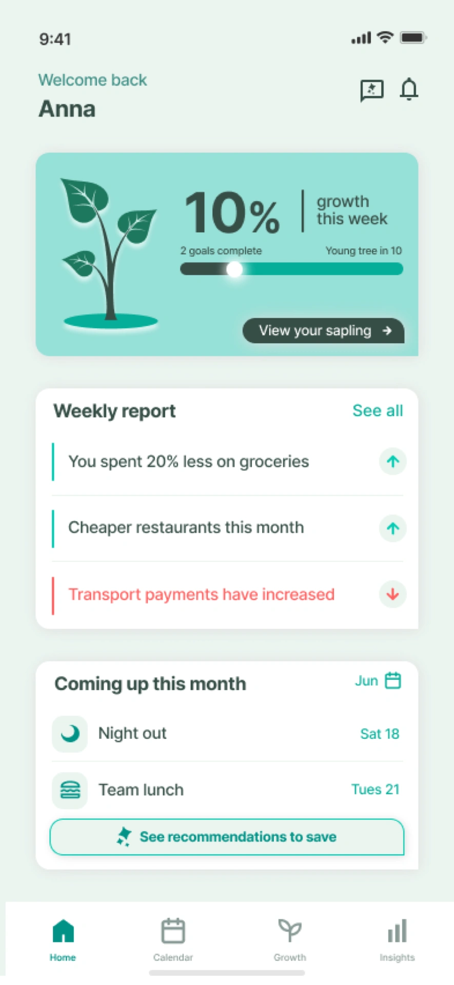
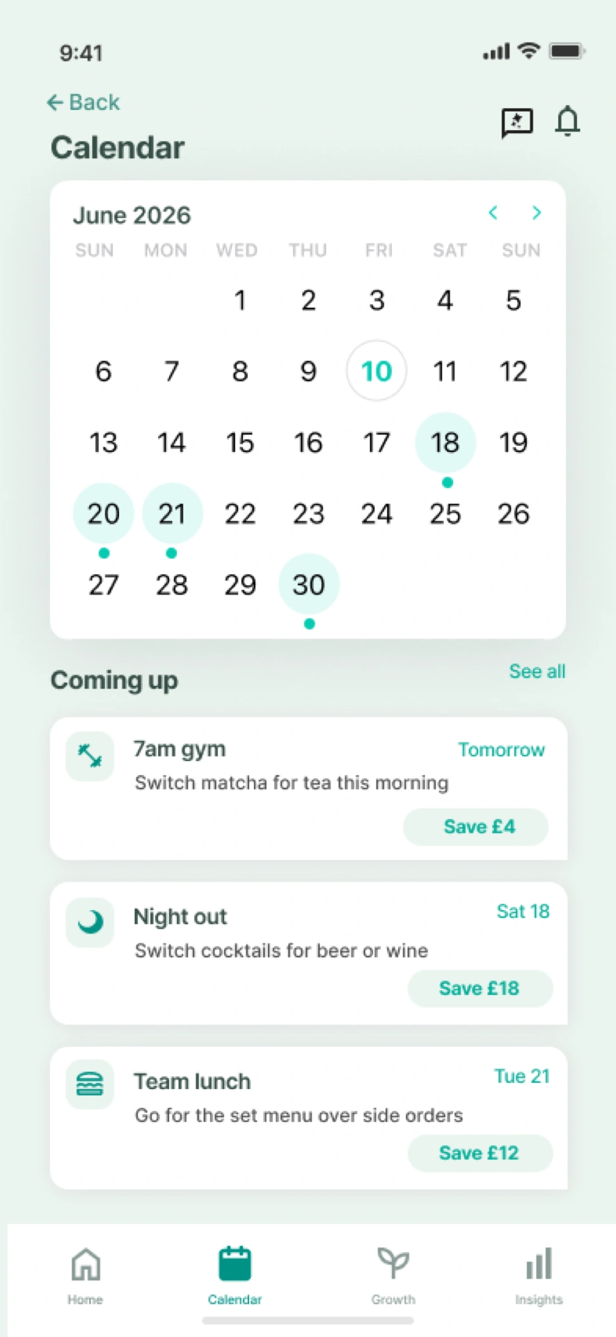
The dashboard brings plant progress, a weekly report and upcoming events into one view. The calendar links example savings suggestions to upcoming events, so the concept supports planning ahead as well as reviewing past spending.
Conclusion
Bring motivation and planning into one concept.
PocketWise brings motivation, event-led planning and visible choices into one interface concept, with a growing plant making saving tangible and calendar-led pre-planning helping people prepare for spending before it happens. The main design thread is explaining a request before asking people to act on it.
The next step is to evaluate whether people understand the suggestions and can continue without connecting a calendar.
From there, the app could develop through a tiered subscription that rewards good financial habits with a reduced fee, deeper AI pre-planning through email and Apple Wallet integration, and a built-in calendar that turns screenshots of bookings and tickets into planned spending automatically.